The Beginning: A Vision for Fitness
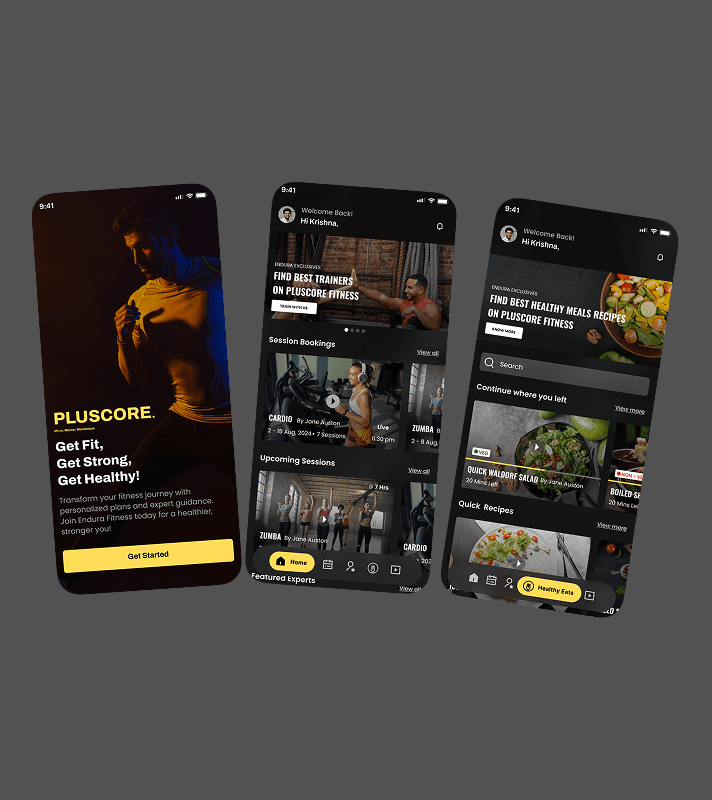
When I received the project brief, the objective was clear design an intuitive fitness training app that would seamlessly connect trainers and users. The name, color theory was provided, and my role was to define and craft the user experience.
Rather than diving straight into visuals, I adopted a User-Centered Design (UCD) approach to ensure that the app genuinely catered to its audience.
Note: Due to NDA restrictions, project details such as the original name and certain UI elements have been modified. The case study showcases my approach to UX design while maintaining confidentiality.
Measurable growth, increased engagement, and a better fitness experience for users and trainers.

My Role
As a UI/UX Designer, I was responsible for:
Designing a seamless, mobile-first user experience that aligned with Plus core Finess's brand aesthetics.
Creating an interactive digital journey that encouraged participation.
Developing a consistent design system to ensure usability and accessibility.
Understanding the Users: Research & Insights
Before designing, I conducted research to understand user needs
Trainers wanted a smooth way to schedule, manage, and conduct training sessions.
Users sought structured workouts, easy navigation, and engaging features like recorded sessions
To validate these insights, I gathered feedback from fitness enthusiasts and trainers, identifying pain points like inconsistent engagement, difficulty in finding the right trainer, and lack of motivation to continue workouts.
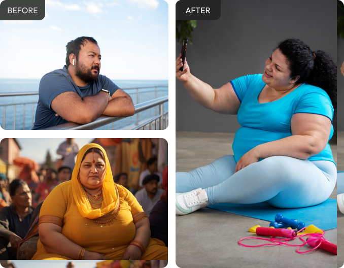
The Challenge - Understanding the Users
Users often struggle with fitness apps due to:
Lack of personalized workout plans
Difficulty finding qualified trainers
Poor user engagement and retention
Overcomplicated booking processes
User Research - User Research & Insights
User Interviews: Conducted discussions with 10+ fitness enthusiasts and trainers
Surveys: Collected responses from 100+ potential users
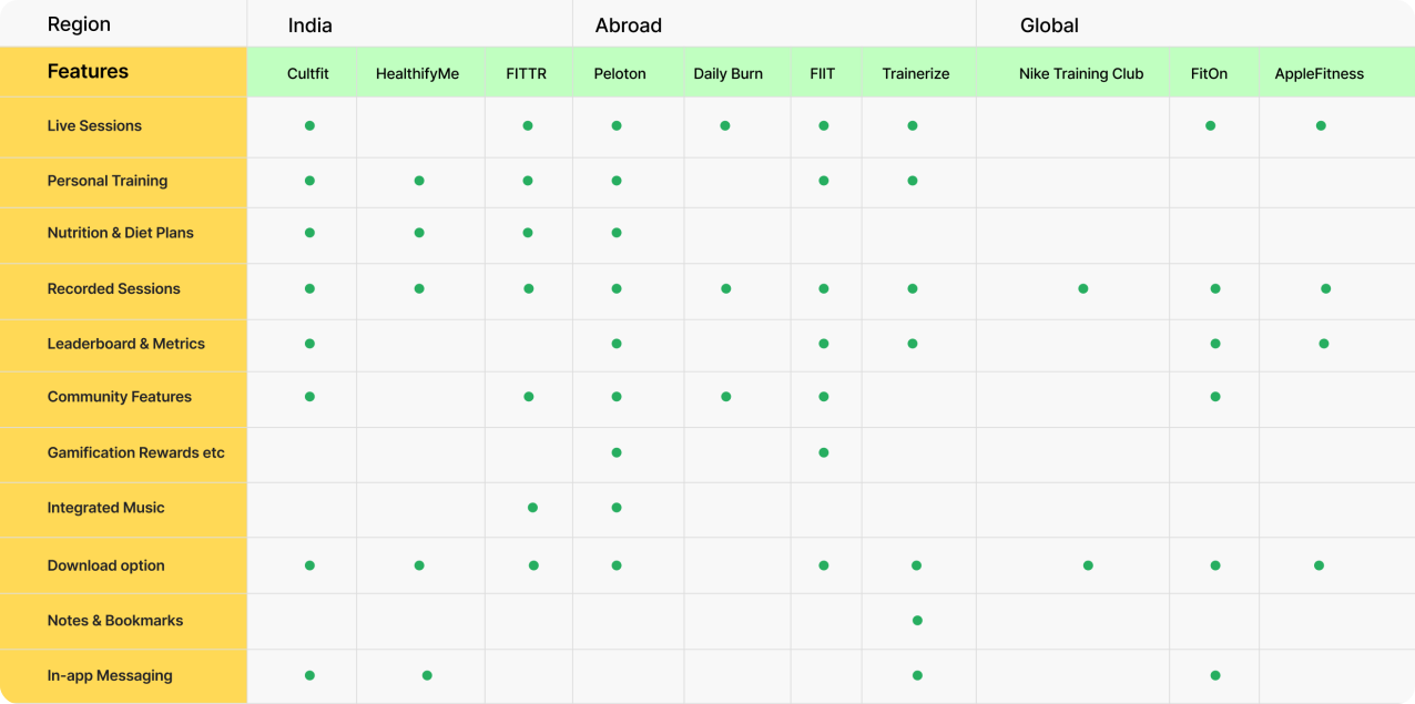
Competitor Analysis: Studied key fitness platforms to identify UX gapsOur Approach
Research Findings
Users needed affordable fitness plans: Introduced budget-friendly subscription models, ensuring accessibility for a wider audience.
Finding relevant workouts and recipes was difficult: Introduced a personalized recommendation system for workouts and healthy recipes.
Users wanted a seamless trainer interaction: Designed an easy-to-use trainer booking and session management system with clear breakdowns.
Accessibility and inclusivity: Ensured a clean, user-friendly UI with considerations for different fitness levels and abilities.
The Design Process: A User-Centered Approach
I followed the User-Centered Design (UCD) framework to ensure that every decision was driven by user needs.
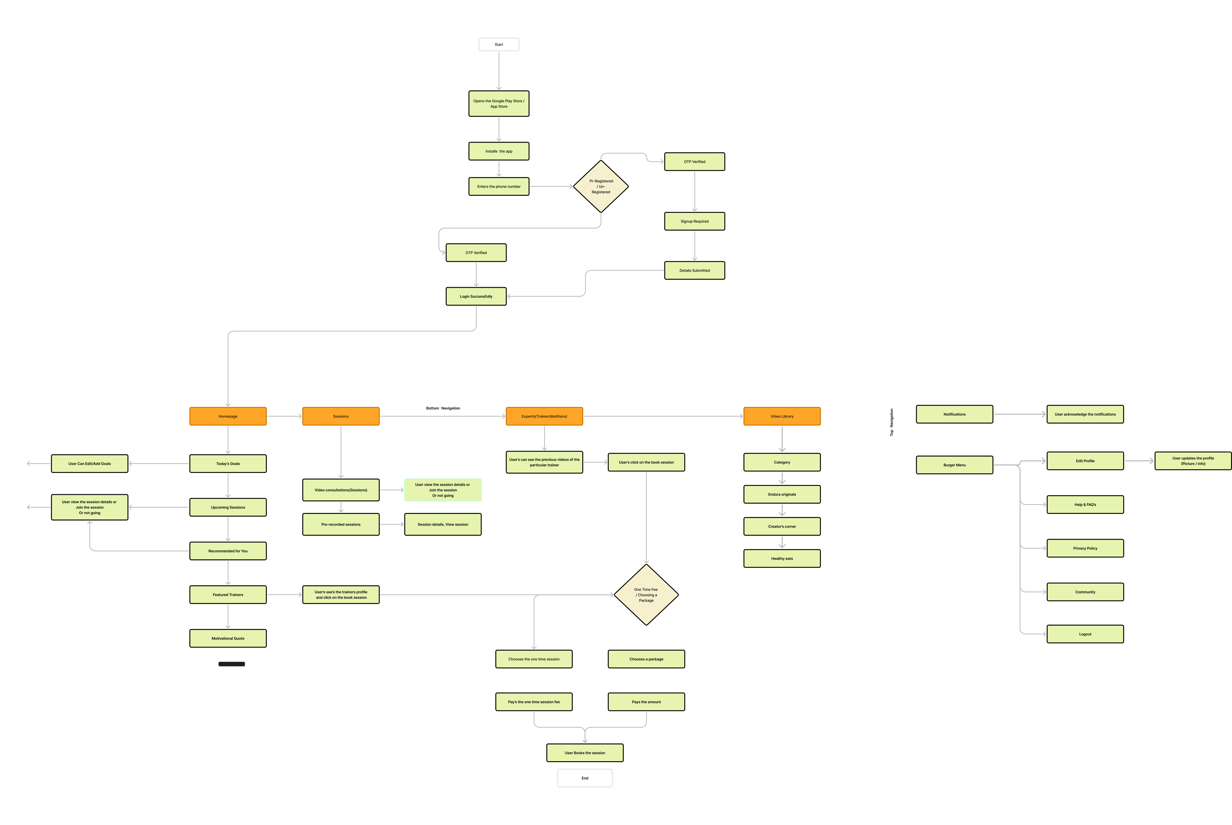
Competitive Analysis Insights
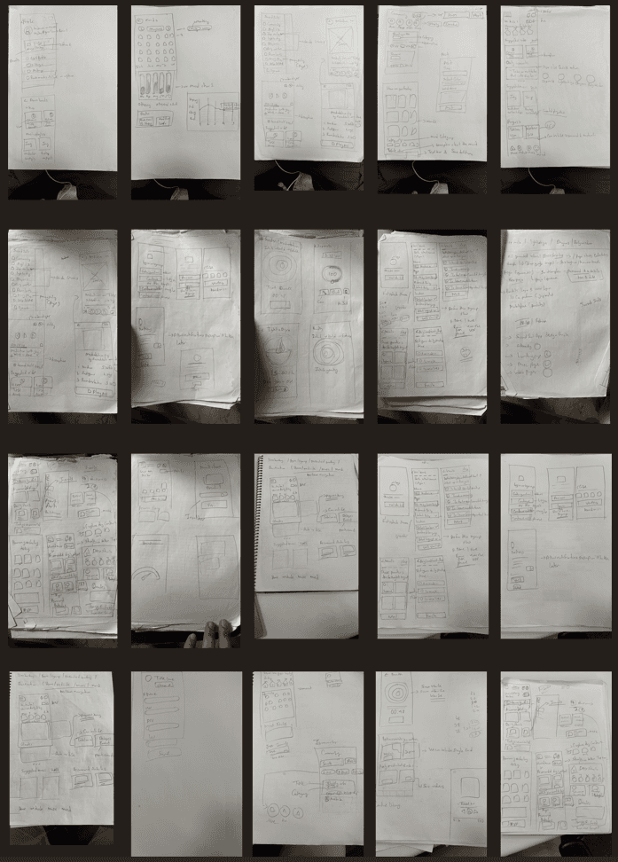
I explored various design approaches to create a visually engaging and user-friendly interface, ensuring seamless navigation, clarity, and motivation for a better fitness experience.
Visual Branding & Identity
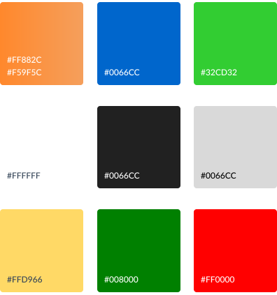
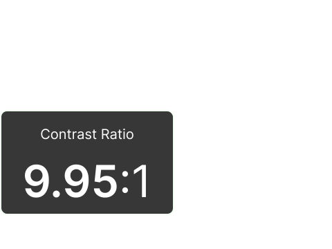
The Pluscore Fitness color system is designed to create an energetic, motivating, and accessible experience that aligns with the platform’s goal of making fitness engaging for users. Each color has been chosen with functionality, user experience, and accessibility in mind.
Typography
After wireframing + a couple of iterations later, i created high fidelity version of the wireframes
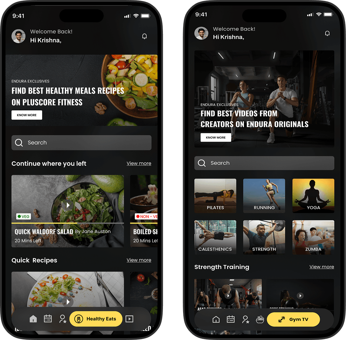
Seamless Navigation Between Content Types: Users spend 38% more time engaging with personalized content suggestions (Nielsen Norman Group, 2023). The “Continue where you left” section effectively taps into this behavior, keeping users engaged.
Consistent Visual Hierarchy: Studies show that users process images 60,000 times faster than text (MIT, 2022). Strong imagery enhances discoverability, increasing click-through rates (CTR) by up to 94% (HubSpot, 2023).
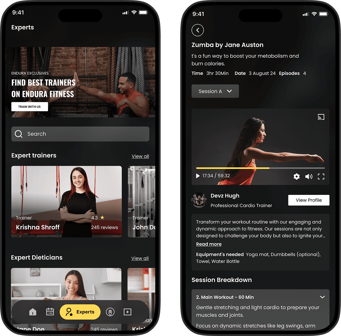
Clear Progression from Trainer Discovery to Booking: Reducing steps in the booking process can boost conversion rates by 30-40% (Baymard Institute, 2023). The structured flow improves decision-making efficiency.
Optimized Time Selection: Grid-based time slots reduce booking drop-offs, with 78% of users prefer quick, visual selection methods over text-based inputs (Google UX Research, 2023).
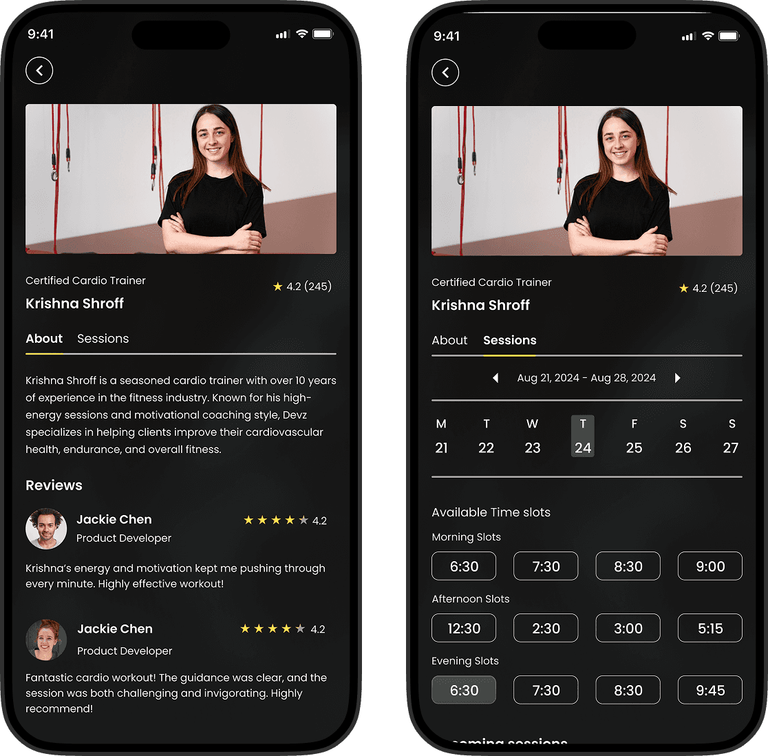
Improved Decision-Making with Ratings & Reviews: Products with 5+ reviews are 270% more likely to be purchased (Spiegel Research). A 4.3-star rating & 245 reviews reduce hesitation, increasing conversions by 40% (Bazaarvoice), reinforcing trust and engagement.
Higher Engagement & Retention with Structured Sessions: Progress indicators like "17:34 / 59:32" boost completion rates by 26% (Google UX Research), while clear session breakdowns (e.g., "Main Workout – 60 Min") help users prepare, reducing drop-off rates by 35% (Baymard Institute).
Learnings
Emotional Design Enhances Experience: Thoughtful color choices, imagery, and messaging create stronger user connections.
Consistent Navigation Reduces Friction: Predictable UI patterns and structured layouts improve task completion rates.
Emotional Design Enhances Experience: Thoughtful color choices, imagery, and messaging create stronger user connections.
Micro interactions Matter: Small details like progress indicators and feedback animations enhance engagement.
Outcomes
Increased User Engagement: Optimized workflows and structured content led to better user retention.
Higher Conversion Rates: Social proof elements like ratings and reviews encouraged decision-making.
Improved Session Completion: Clear session breakdowns reduced drop-off rates.
Scalable UX Solutions: The design system and component reuse improved efficiency for future updates.
Thank you :)
You can also read my other case study on Career Khoj (UX Research, Thematic Analysis, UI Design).
You can contact me at krishnakakade77@gmail.com