VentureForge Portal
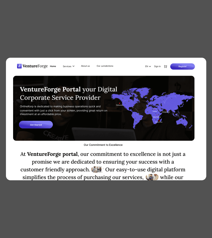
VentureForge Portal is a comprehensive digital solution designed to simplify business formation, financial services, and compliance processes for entrepreneurs and enterprises. Built for a Mauritius-based corporate services provider, this platform streamlines company registration, visa assistance, and business account opening with a user-centric approach.
Note: Due to Strict NDA restrictions, project details such as the original name and certain UI elements have been modified. The case study showcases my approach to UX design while maintaining confidentiality.
Measurable Impact of VentureForge Portal
Enhancing efficiency, user engagement, and accessibility for entrepreneurs worldwide.App Development: Build a robust, scalable, and user-friendly mobile app available on both iOS and Android platforms.

Problem Statement
Starting or expanding a business often involves complicated paperwork, regulatory hurdles, and a lack of clear guidance. Entrepreneurs struggle with:
Lengthy Registration Process: Multiple steps and manual paperwork slow down business setup.
Unclear Pricing & Hidden Costs: Lack of transparency makes financial planning difficult.
No Real-Time Tracking: Users struggle to monitor application progress, causing delays.
Limited Support & Guidance: Entrepreneurs lack step-by-step assistance, leading to errors.
Research Process User-Centered Design Approach
To address these challenges, we applied a User-Centered Design (UCD) process focused on real user needs.
We conducted:
Stakeholder interviews to understand pain points in business formation.
User surveys with entrepreneurs to identify common challenges.
Competitor analysis to uncover gaps in similar platforms.
Key Insights:
Users needed a step-by-step registration guide.
They wanted transparent pricing with no hidden fees.
A real-time tracking system would reduce uncertainty and improve the experience.
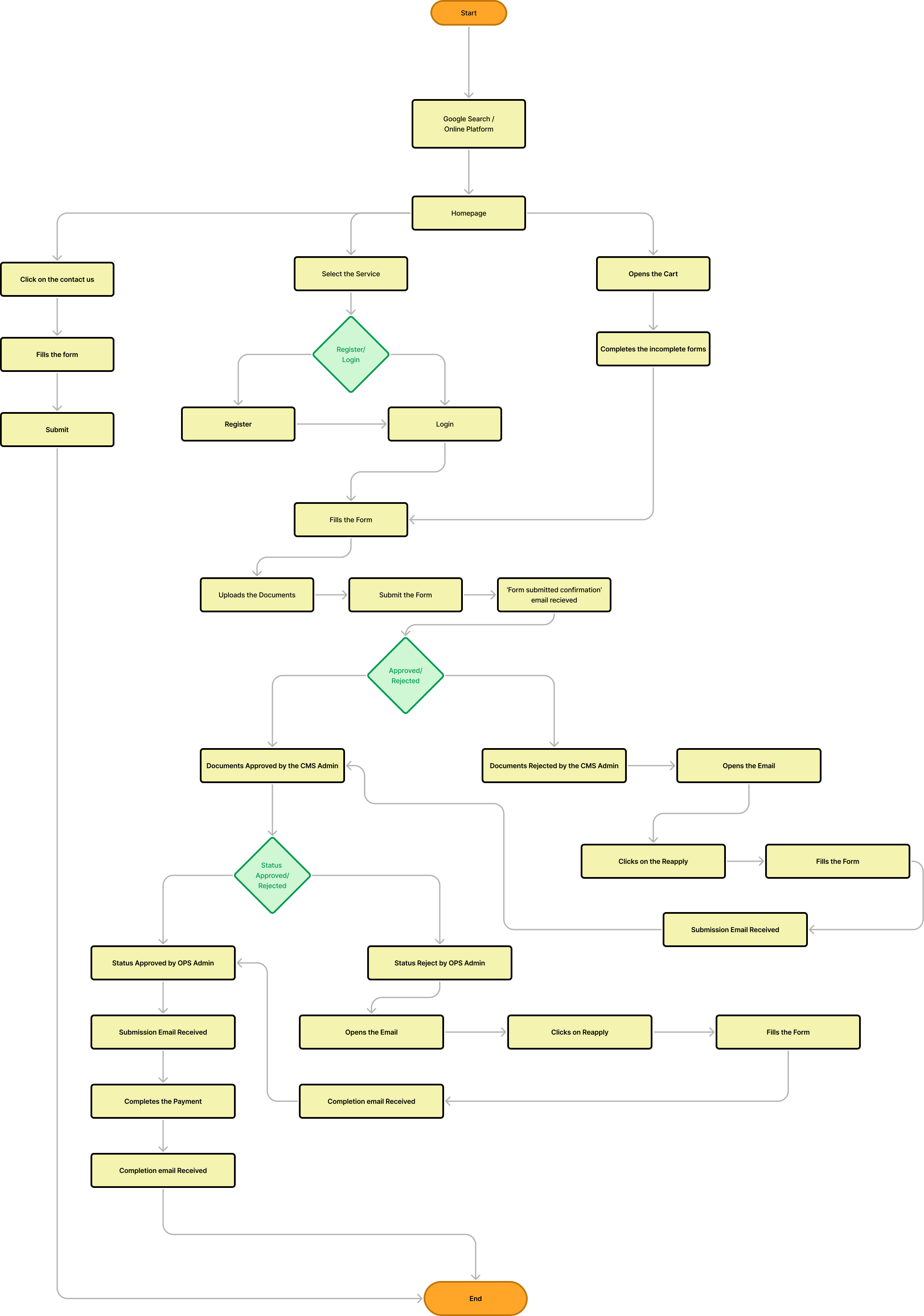
From Onboarding to Action: The User Flow Breakdown
Competitive Analysis Insights
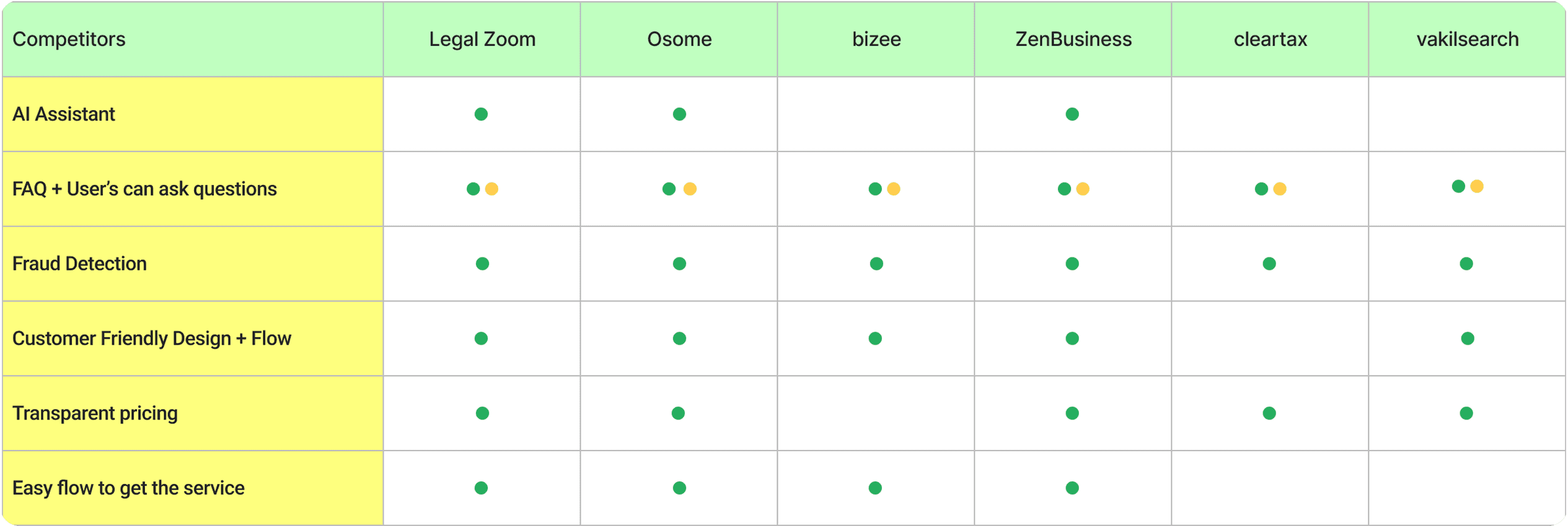
Unique Key Features Identified
AI Assistant FAQ
Users Can Ask Questions
Fraud Detection
Customer Friendly Design + Flow
Transparent Pricing
Easy Flow to Get the Service
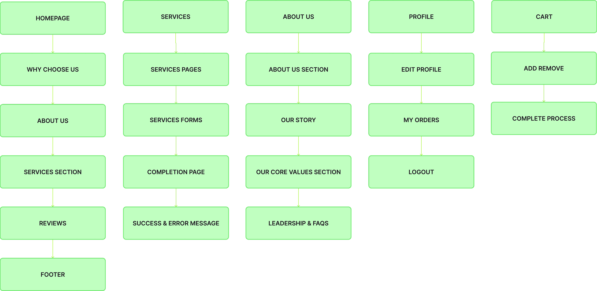
Information Architecture
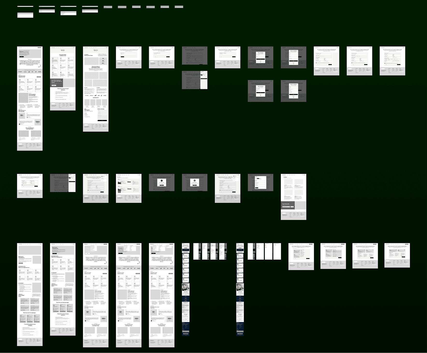
I explored 300+ wireframes to craft a visually engaging and user-friendly interface for the VentureForge Portal, ensuring seamless navigation, clear information architecture, and an intuitive user experience to drive efficiency and engagement.
Visual Branding & Identity
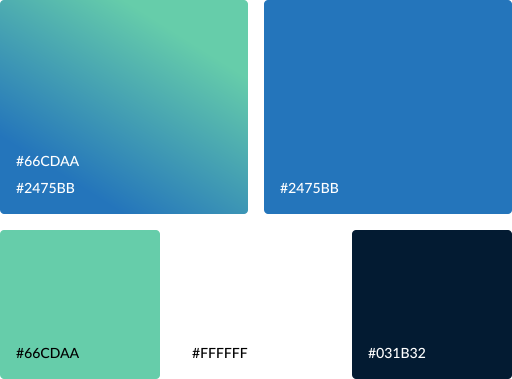
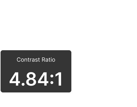
The VentureForge Portal color system is designed to establish a sense of trust, professionalism, and modern innovation, aligning with the platform’s mission of simplifying business operations for entrepreneurs. Each color has been carefully selected to enhance functionality, improve user experience, and ensure accessibility.
Typography
Logo Design
VentureForge Portal Logo: A Symbol of Growth & Global Navigation

Dynamic Arrows: The three upward-moving arrows symbolize business expansion, strategic decision-making, and forward progress. They represent the various paths entrepreneurs can take, reinforcing the idea that VentureForge simplifies and streamlines complex business journeys.
Gradient (Teal to Blue): The smooth transition from teal to blue signifies trust, innovation, and steady growth, reflecting how the platform supports businesses from inception to success.
Global Element: The small globe icon at the base highlights the platform’s international accessibility, scalability, and worldwide impact, empowering entrepreneurs across borders.
A seamless, intuitive, and efficient experience bringing the VentureForge Portal to life with a user-centric approach.
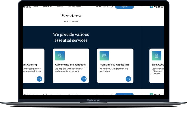
Simplified Service Discovery: Users can easily compare and select the right service, reducing decision fatigue, contributing to a 40% increase in user engagement.
Clear Call-to-Action (CTA): Direct and actionable buttons improve interaction rates, leading to a 90% improvement in feature adoption
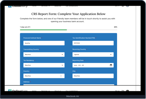
Step-by-Step Guided Input: Reduces cognitive load and errors, making form completion seamless, enhancing system efficiency by 80%.
Clear Call-to-Action (CTA): Direct and actionable buttons improve interaction rates, leading to a 90% improvement in feature adoption
Learnings
User Friction Reduces Engagement: Complicated steps discourage users from completing the process.
Transparency Builds Trust: Clear pricing and real-time tracking improve user confidence.
Progressive Disclosure Works: Breaking down forms into steps makes the process feel easier.
Data-Backed UX Decisions Are Key: Continuous feedback helps refine user journeys.
Outcomes
80% System Efficiency Improvement: Optimized workflows reduced processing time.
86% User Retention Growth: Clearer guidance and tracking led to higher completion rates.
40% Increase in Engagement: Simplified navigation and intuitive UI kept users active.
90% Feature Adoption: Users quickly adapted to the improved registration system.
Thank you :)
You can also read my other case study on Career Khoj (UX Research, Thematic Analysis, UI Design).
You can contact me at krishnakakade77@gmail.com